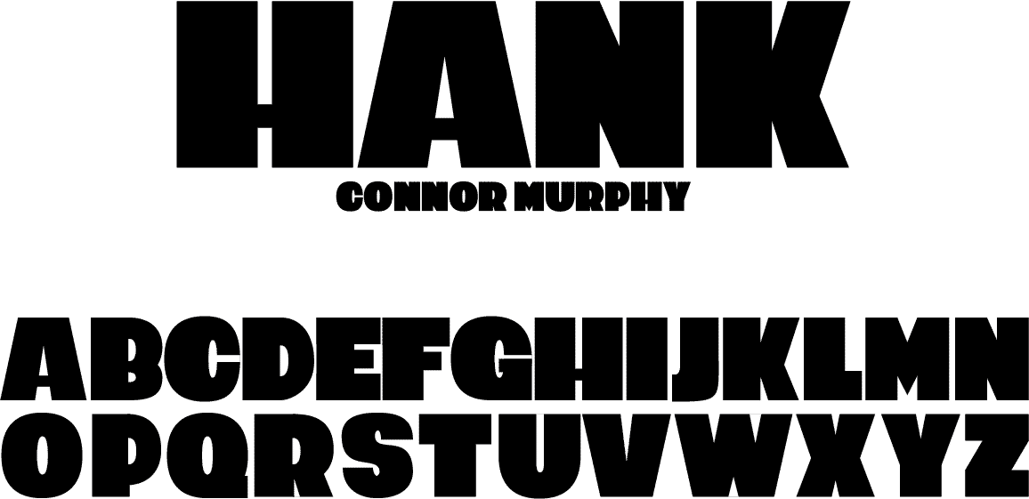
Hank Display Typeface
In my Typeface Design course at Fitchburg State, I studied under professor Don Tarallo, and spent an entire semester working through the system of characters, adjusting each one to match the rest, and making sure each change fit the feeling of the typeface overall. Hank was designed to be macho, somewhat comedic, and very heavy.
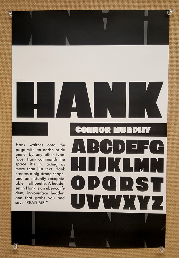
This is a promotional poster designed for my typeface Hank. The text reads:
“Hank waltzes onto the page with an oafish pride unmet by any other typeface. Hank commands the space it's in, acting as more than just text. Hank creates a strong shape, and an instantly recognizable silhouette. A header typed in Hank is an uber-confident, in-your-face header, one that grabs you by the shoulders and says READ ME!”